Essay
Getting to the Customer – Why Everything You Think about User-Centred Design is Wrong
Let me ask you a question.
If you had an idea for a new hammer and you wanted to test it, which of the following ways do you think would yield you the most valuable feedback?
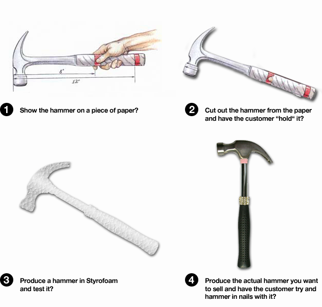
I am guessing most of you would choose #4. After all, getting a feel for the hammer requires the customer to actually try it out. Looking at a picture of a hammer, cutting it out, or even providing a Styrofoam prototype simply won’t provide you or the customer with sufficient foundation on which to evaluate it.
However, if I asked you to test a digital product, whether it be a website, an application or an e-commerce site, most of you would choose #1, 2 or 3.
Isn’t that odd?
A simple product like a hammer is best tested in its final form. But a digital product, that in some ways is much more complex, is tested by lesser means, as if you could extract important feedback about the hammer.
Nonetheless, this is the current reality of applied UCD, or User-Centered Design.
Usability tests, focus groups and personas to name a few, all are intended to increase usability, and create better products by having users test them.
There is something flawed in this approach. What is wrong is that it doesn’t deliver on that promise. Valuable resources are being used on what one could arguably call a placebo for uncertainty.
Clarification:Some people have commented on this. I am not saying that you shouldn’t do 1, 2 or 3. I am saying you shouldn’t test 1, 2 or 3 on users—you should, though, go as far as 4 and then test as much as possible.
Correct theory, wrong application
Now, there are many different interpretations of UCD. Is it a theory, or a process, or both?
Wikipedia states:
“In broad terms, user-centered design (UCD) is a design philosophy and a process in which the needs, wants, and limitations of end users of an interface or document are given extensive attention at each stage of the design process. User-centered design can be characterized as a multi-stage problem solving process that not only requires designers to analyze and foresee how users are likely to use an interface, but also to test the validity of their assumptions with regards to user behaviour in real world tests with actual users. Such testing is necessary as it is often very difficult for the designers of an interface to understand intuitively what a first-time user of their design experiences, and what each user’s learning curve may look like.
The chief difference from other interface design philosophies is that user-centered design tries to optimize the user interface around how people can, want, or need to work, rather than forcing the users to change how they work to accommodate the software developers approach.”
Doesn’t sound too bad, does it?
In theory, it makes a lot of sense. Getting feedback from users about your product will provide you with valuable insights as to what works and what doesn’t. The users are, to state the obvious, the ones who are going to be using it, so their input is going to be valuable.
It’s also a correct assumption that designers, in theory, cannot foresee how users are likely to use an interface, thus their assumptions must be tested.
A long learning curve is clearly an issue when it comes to getting users to adopt your product. It needs to be easy to sign up, log in, buy, navigate, understand, and utilize what your product offers. Too often the software determines the option space of designers, forcing them to design less than optimal solutions.
So, in many ways, there is no problem with the philosophical definition of UCD. Involving users is critical if you want your products to be used.
No, the devil is in the actual practical outcome of this philosophy—what I call applied UCD.
Here is a typical UCD process for web or application design. (source: http://www.w3.org/WAI/EO/2003/ucd)
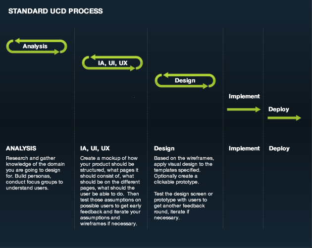
Have a look at the model again. Look at the last two parts of the process. Yes, you got that right. Generally there isn’t much to say about implementation and deployment from an UCD point of view. It’s normally not considered part of the process. On the contrary, it is most often assumed that, once you have gone through the process of choices 1, 2 and 3, the UCD process is complete, and you have established a solid solution.
So, as you can see, a typical UCD process, to define it in terms of our hammer test, is based on testing the drawing, the cutout and the Styrofoam hammer—not the actual hammer.
So why is that? How come something that appears such an obvious problematic implementation of the goal of UCD, has become the norm?
I believe there is a series of reasons for this, that I will attempt to cover here.
Waterfall process
Historically, development of digital products has been based on the waterfall method. This made it very expensive for organizations to change things once the product was deployed. So, with UCD promising to test the usability and relevance of the product before it went into production, it’s no wonder it gained so much traction in the 1990s.
UCD has its origins in academia, not in design or engineering
With heavyweights such as Jakob Nielsen, Jared Spool and Don Norman’s extensive and fantastic research, it’s easy to see why UCD has gained traction. There is an answer to almost every question or problem you can devise. Facts provided about users are based on years of research.
Most UCD proponents and practitioners are academics
It’s easy to see why the usability community has picked up on this research and why they consider it more valuable than, say, theory of typography or grid structures, color theory, engineering, animation, programming or development process, or even marketing. It’s a continuation of the academic process they know so well, no matter their original domain.
‘Get out of jail free’ card
As I mentioned in an earlier post, most large and management-driven organizations don’t allow for mistakes. They religiously demand certainty, and consequently punish uncertainty. If you don’t have your back covered, if your project tanks, you are headed for trouble. UCD is the perceived guarantee that your product has been tested thoroughly by way of user tests. Managers use this as a way to get some of the responsibility outsourced.
The user’s advocate
Humans are not just machines. We aim to serve higher goals. Many usability experts see themselves as advocates for the user. There is a sense of purpose greater than just “doing the work” within the UCD community. It has created a strong sense of purpose, and a strong, almost moral culture around users.
With the above in mind it’s not difficult to understand why UCD has gained such success the last decade.
With both extensive research, great academic minds, economic incentives, get out of jail free cards and a sense of certainty, it’s a sure sell. Why should companies not want to utilize UCD to design better and more usable products?
The following observations may make this more evident.
Customers are not users
The first issue is with the term user. It might seem like a rhetorical nitpick but it speaks volume of one of the main issues and misconceptions with applied UCD.
Users are of statistical value meaning, i.e., what we know of users we know through the research that has been done on them. Users are of relevance to the field of usability, but not to the field of product design. It has no actual reference to whether a product will gain adoption or not.
Users are not customers
A customer is someone who, through all the noise of competition, has chosen your product over someone else’s.
What might be a no-go from a user’s point of view (statistical) might not be a no-go from a customer’s (utilitarian) point of view.
What matters is that you design for the customers of the organization instead of the users of your ideology. If you design for users, you end up spending a lot of time on pseudo problems that might have ideological value but no implication for the adoption of a product.
According to studies by J.Nielsen, users don’t scroll. Although this might be the case from a statistical point of view, it is certainly not of pragmatic value. Maybe what was tested was not relevant enough to make the user to want to scroll. Maybe the design was executed in a way that obscured the fact that you could scroll.
In fact, users scroll more than ever, yet this myth is continuously being upheld.
If you design for customers, you are forced to think about how to benefit the relationship between the customer and the organization. If you design for customers, you design for the jobs they are trying to do. You are designing for an optimal solution, not necessarily a perfect solution.
Be the advocate for the customer relationship, not for the users.
The map is not the territory
We can draw up as many plans, diagrams and projections as we wish. A product before it’s launched is not a product yet. It’s a set of ideas, sketches, designs and assumptions, maybe even some patent-pending technology.
It’s a map of how the designers envision the product. But it’s not a product. It has no actual form; it doesn’t belong to an ecosystem; the user can only think about how it might work. In short, it doesn’t contain any of the qualifiers that make a product a product.
So the kind of feedback that UCD provides before and after deployment is not the same. They are two very different paradigms.
One is a paradigm of ideology and thus provides information of theoretical value. The other is a paradigm of application and utility, and provides real-world, real-time feedback.
Pseudo environment
What you are solving in the wireframe phase are problems inherent in the wireframe phase, not problems with the product. What you are solving when testing the prototype are problems inherent in the prototype, not in the final product. There is only one true test and that is the final product. Only then will you start to receive valuable feedback in combination with quantitative feedback. You will get it from where it matters most.
No transcendence
By this I mean there is no quality transfer from insights you establish in the testing of your product into the design and development phase. One reason as already stated is that problems are addressed in a pseudo environment instead of an actual one.
Another reason is that what makes products successful and usable is only really obvious in the final form and environment. With UCD notorious for dealing with the product before implementation and deployment, it relies on the assumption that it can solve problems before they arise. It relies on the assumption that, by fixing the usability issues, your product will have a greater chance for success. This is, quite simply, wrong, and flies in the face of reality.
Intuition is neither objective nor always the goal
Intuitive behavior is not an objective standard. It’s a slow-moving target. If something becomes the default way of doing something, then it has become the intuitive way of doing it. You don’t need to test for that; you use design patterns. They are the product of the norm.
Some of the most successful products weren’t intuitive to begin with. They became intuitive after the product gained sufficient popularity. So, even if a product fails the intuitive test, it does not impact whether or not it becomes a success.
Usability studies and focus groups are for refinement, not for innovation
Again, the problem is in thinking in terms of users instead of customers. Something might fail being intuitive or make sense from an ideological point of view, but it still helps customers do a job that makes them ready to endure the learning curve.
Therefore, forcing a user-centric model to evaluate your ideas can be completely damaging to your assessment of your product’s likelihood of success.
When you test your product, whether by focus groups or user tests, many other factors determine the outcome of a session. Social dynamics, groupthink, the “dumb” expert, and dealing with a product in the abstract.
Implementation is a black box
When most companies exercised waterfall methodology, UCD had some value. But, today, the landscape is different. Implementation is part of the design process. With agile, continuous integration and continuous deployment methodologies, and the speed at which products appear, no longer is there room or need for lengthy processes that only obfuscate the goal of making good solutions through the division of UCD phase and the implementation phase.
Good UCD processes mean good products
Well, no, unfortunately, this is not the case. Successful products have nothing to do with the process as such. A good process merely allows you to cover what needs to be done.
It allows you to collect the necessary data and create the structure of your product, to map out what needs to be done, who should do it, and in what order it needs to be done.
Putting users into the process after research and before the final product is finished provides primarily pseudo value. It confuses users with customers, and is responsible for valuable time being wasted in a pseudo environment tackling pseudo problems that have no bearing on those you may find yourself with after the launch.
However, at that point it’s too late, since applied UCD normally leaves the building right before the implementation starts, and where the product really starts to take shape.
This is where UCD really fails.
What is required to create good products is not the ability to test your idea or the usability with users. What is necessary is testing the finished product with customers and improving it from there. This requires a different approach to thinking, and a different set of skills.
Testing users is about testing the current state of usability and intuition. This belongs to the type of research that people like J.Nilesen, J.Spool and others perform so well. It contains a lot of valuable knowledge and should be the foundation for anyone wanting to do UCD.
But testing customers means getting the product in their hands, and learning how it behaves; to pinpoint problem areas and then figure out ways to improve it. It allows you to test the actual problems instead of a number of pseudo problems that may never arise.
Summing up the problem with applied UCD
Applied UCD has wedged itself into a corner from which it will be difficult to extricate itself. It must extricate itself if it wants to remain relevant.
On one hand, UCD is as successful as ever; the area is very well covered. Lots of research and lots of value have historically come out of this area—understanding the users is important.
On the other hand, it has become successful on the wrong premise. Too often, it is used simply to push responsibility away from those who should have it. And when it’s not, it’s being misapplied for some of the reasons mentioned above. It’s being perceived as providing certainty where none really exist.
The speed at which products, services and applications are being launched today is increasing rapidly. There is more competition, but, also, products are built and iterated much more rapidly than they once were. And with the move away from waterfall methodology, the consequence is that UCD proponents and practitioners need to rethink just where it is in the process they see themselves adding value. There is nothing today that hinders a process in which products are launched before they are tested and then iterated if necessary. A revised UCD process would look something like this:
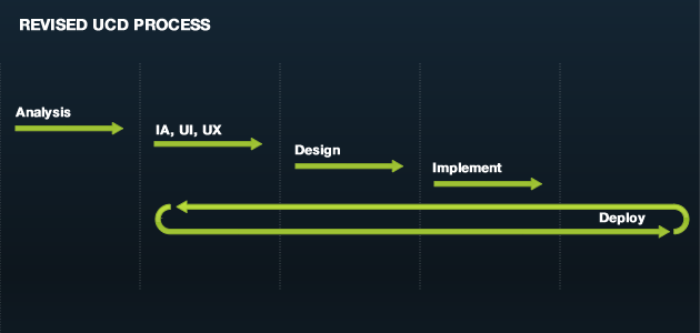
In this way, users become customers, giving you the opportunity to test where it matters with valuable feedback.
This will no doubt mean that many have to re-educate themselves, and rethink how they approach design, whether it be UX, IA, UI or GUI. Nonetheless, as stated, it is necessary to stay relevant for the future. A pivotal part of this will also be to re-educate clients and help them understand they must look at at product design a little differently.
Design is a decision, not a democracy. If you are serious about using design strategically, then courage is the strategic advantage you should aim for. With the ability to quickly adjust wrong assumptions, it’s not about risk, just common sense.
If you want to see how to get to the customers before you start testing, look at another post of mine. Here I try to give some principles for designing digital products.
Let me know what you think.
First off, I really enjoyed reading this article. I can tell a lot of thought was put into it and it brings up some great debatable topics within the UCD / UX community. Thankfully, all of the products I’ve worked on in the past couple of years have followed a very iterative process, much like your revised UCD diagram. In this model, there never is a final product because the product is always evolving based on customers or users.
That revised UCD process is actually what I would refer to as more of a user (customer) experience process more along the lines of Lean UX. UCD is fairly academic and determining the state of usability / intuition can help inform product decisions from a high level. Let’s leave UCD as just that – it doesn’t need to be more. The entire experience a customer gets from a product and how the product evolves to provide the most satisfactory experience is a different beast altogether.
I agree with you that UCD is not a great way to create a product, but this industry already has a problem with semantics and trying to push UCD as more than it should be just adds confusion.
Can’t wait to see the new one.
I’m co-founder of @ChaosCreative, a digital agency out of Nigeria and some of this stuff that might be old to you is really just be understood, let alone implemented, here. We’ll be keeping a close eye on your blog.
Keep up the good work.
Thank you very much. It’s old now but things have only gotten worse :) I am writing a new article about the same subject which should be out soon but with a different angle.
A truly mind-melting article. The part about the difference between a user and a customer is truly an epiphany. Thanks.
Brilliant presentation of user centered design. It’s great to be able to gather so much insight in one article – Love the hammer analogy. Thanks much!
see this is what, if the creator itself is a good user then its UCD right!!!!
What are common usability myths?…
http://000fff.org/getting-to-the-customer-why-everything-you-think-about-user-centred-design-is-wrong/ Basically the myth is that you can usability test your way to success….
[…] Źródło: Black&White™ » Blog Archive » Getting to the Customer – Why Everything You Think about Use… […]
[…] Why everything you think about User Centered Design in Wrong […]
[…] http://www.zeldman.com/2009/11/24/on-self-promotion/ http://000fff.org/getting-to-the-customer-why-everything-you-think-about-user-centred-design-is-wron… http://www.smashingmagazine.com/the-death-of-the-blog-post/ […]
Ha!
Sure but I need to involve all the other users and get their opinion about colors too.
Can you guess which color that is going to be :)
Interesting point of view and well written article. I know a lot more about this topic now thanks to your post.Cheers
[…] Why everything you think about User Centered Design in Wrong […]
[…] Why everything you think about User Centered Design in Wrong On Self Promotion The death of the boring blog post #2 – A VC(http://www.avc.com) […]
[…] Why everything you think about User Centered Design in Wrong […]
[…] Why everything you think about User Centered Design in Wrong […]
[…] Why everything you think about User Centered Design in Wrong […]
[…] segundo lugar se lanzaba a escribir sobre DCU y sobre la conveniencia de las últimas etapas marcadas en un proces…. Utilizando el ejemplo del martillo de su post anterior comparaba la fabricación y el testeo de […]
[…] Why everything you think about User Centered Design in Wrong […]
[…] Why everything you think about User Centered Design in Wrong […]
[…] Why everything you think about User Centered Design in Wrong […]
[…] Why everything you think about User Centered Design in Wrong […]
[…] Why everything you think about User Centered Design in Wrong […]
[…] Why everything you think about User Centered Design in Wrong […]
[…] Why everything you think about User Centered Design in Wrong […]
[…] Why everything you think about User Centered Design in Wrong […]
[…] Why everything you think about User Centered Design in Wrong […]
[…] Why everything you think about User Centered Design in Wrong […]
[…] Why everything you think about User Centered Design in Wrong […]
[…] Why everything you think about User Centered Design in Wrong […]
[…] Why everything you think about User Centered Design in Wrong […]
[…] Why everything you think about User Centered Design in Wrong […]
[…] Why everything you think about User Centered Design in Wrong […]
[…] Why everything you think about User Centered D… […]
[…] Why everything you think about User Centered Design in Wrong […]
[…] 9. 망치 디자인과 디지털 제품 디자인의 차이 http://000fff.org/getting-to-the-customer-why-everything-you-think-about-user-centred-design-is-wron… 10. Prototyping: A Practitioner’s Guide의 저자 인터뷰 […]
[…] http://www.zeldman.com/2009/11/24/on-self-promotion/ http://000fff.org/getting-to-the-customer-why-everything-you-think-about-user-centred-design-is-wron… http://www.smashingmagazine.com/the-death-of-the-blog-post/ […]
[…] http://www.zeldman.com/2009/11/24/on-self-promotion/ http://000fff.org/getting-to-the-customer-why-everything-you-think-about-user-centred-design-is-wron… http://www.smashingmagazine.com/the-death-of-the-blog-post/ […]
By far the most enlighten articles about the subject. It just makes so much sense to what I’ve experienced. Thanks – please do write a book or something :)!
Great article. The other thing – maybe it’s going to be too harsh – the customers are not creative; when they see a new product they are dull; they don’t know what they can do with it. The seller has to show them the light. However; once the customers get the spark they turn into a wild beast. Like a child they want new features all the time; they have questions every second…
So I agree without having a complete product – plus without having complete scenarios to be marketed to customers – there is not much to test.
On the other hand; careful observation of the market and the potential users of the product is a necessity at every stage of all products in development.
I also feel the article is basically attacking straw-men. The example at the very start, of a hammer, shows three options which mock-up different aspects of a hammer (what is looks like, it’s outline, and its 3D shape) and then jump directly to a 4th option where a fully-implemented prototype is created. That’s not how it would go in “real life” where many more different kinds of mock-ups would be made, for example, to test different handle shapes with a constant-weight hammer-head, of different head weights with a constant handle shape, or different claw configurations, etc.
[…] http://www.zeldman.com/2009/11/24/on-self-promotion/ http://000fff.org/getting-to-the-customer-why-everything-you-think-about-user-centred-design-is-wron… http://www.smashingmagazine.com/the-death-of-the-blog-post/ […]
[…] http://www.zeldman.com/2009/11/24/on-self-promotion/ http://000fff.org/getting-to-the-customer-why-everything-you-think-about-user-centred-design-is-wron… http://www.smashingmagazine.com/the-death-of-the-blog-post/ […]
[…] http://www.zeldman.com/2009/11/24/on-self-promotion/ http://000fff.org/getting-to-the-customer-why-everything-you-think-about-user-centred-design-is-wron… http://www.smashingmagazine.com/the-death-of-the-blog-post/ […]
[…] http://www.zeldman.com/2009/11/24/on-self-promotion/ http://000fff.org/getting-to-the-customer-why-everything-you-think-about-user-centred-design-is-wron… http://www.smashingmagazine.com/the-death-of-the-blog-post/ […]
I don’t disagree with the idea that you’ll get better results from testing a finished product than testing a mockup or wireframe or whatever else. The idea, however, is to test at every stage because it’s much cheaper to fix a bad decision early on than it is to change a finished product.
Keep in mind you’re still testing after creating something workable, and you’ll continue to test even after releasing a finished product. User testing doesn’t stop with paper prototypes. Since we’re not all building the next Facebook or Youtube, it’s very important for most of us to get it right early and often.
It doesn’t make a lot of sense to have your developers spend a bunch of time on a design decision that trips up customers. It’s consistently been shown that fixing usability problems improves conversion rates dramatically, and the earlier you can catch these problems, the more money you’re making in the long run.
Unless your project is the next billion-dollar idea, it’s pretty important to do it right. But hey, all we need is a little vision and courage, and it won’t matter what the users think – they’ll all want our products so badly that they’ll jump through whatever usability hurdles we leave up there.
“A customer is someone who, through all the noise of competition has chosen your product and not someone elses.”
Replace the word “someone” with “user,” and it all becomes clear. We’re testing users because we want to find ways to attract the user into becoming a customer. If your site is difficult to use, the user will become a customer somewhere else. If your product is inferior, the user will become a customer somewhere else. The fact that we have to deal with the “noise of competition” at all is probably the best reason to test our products early and often.
Really great article. Stumbled across this and I have to say that a lot is so true and it’s a shame that so many people don’t get it but still are in charge- which results in bad products (which of course was not their fault..)
You also have a little typo in your article – this one: “And it this is where UCD really fails.”
[…] http://www.zeldman.com/2009/11/24/on-self-promotion/ http://000fff.org/getting-to-the-customer-why-everything-you-think-about-user-centred-design-is-wron… http://www.smashingmagazine.com/the-death-of-the-blog-post/ […]
[…] http://www.zeldman.com/2009/11/24/on-self-promotion/ http://000fff.org/getting-to-the-customer-why-everything-you-think-about-user-centred-design-is-wron… http://www.smashingmagazine.com/the-death-of-the-blog-post/ […]
[…] http://www.zeldman.com/2009/11/24/on-self-promotion/ http://000fff.org/getting-to-the-customer-why-everything-you-think-about-user-centred-design-is-wron… http://www.smashingmagazine.com/the-death-of-the-blog-post/ […]
[…] http://www.zeldman.com/2009/11/24/on-self-promotion/ http://000fff.org/getting-to-the-customer-why-everything-you-think-about-user-centred-design-is-wron… http://www.smashingmagazine.com/the-death-of-the-blog-post/ […]
[…] http://www.zeldman.com/2009/11/24/on-self-promotion/ http://000fff.org/getting-to-the-customer-why-everything-you-think-about-user-centred-design-is-wron… http://www.smashingmagazine.com/the-death-of-the-blog-post/ […]
[…] http://www.zeldman.com/2009/11/24/on-self-promotion/ http://000fff.org/getting-to-the-customer-why-everything-you-think-about-user-centred-design-is-wron… http://www.smashingmagazine.com/the-death-of-the-blog-post/ […]
[…] http://www.zeldman.com/2009/11/24/on-self-promotion/ http://000fff.org/getting-to-the-customer-why-everything-you-think-about-user-centred-design-is-wron… http://www.smashingmagazine.com/the-death-of-the-blog-post/ […]
[…] http://000fff­.org/getting-to-the-customer-why&… […]
[…] http://www.zeldman.com/2009/11/24/on-self-promotion/ http://000fff.org/getting-to-the-customer-why-everything-you-think-about-user-centred-design-is-wron… http://www.smashingmagazine.com/the-death-of-the-blog-post/ […]
[…] http://www.zeldman.com/2009/11/24/on-self-promotion/ http://000fff.org/getting-to-the-customer-why-everything-you-think-about-user-centred-design-is-wron… http://www.smashingmagazine.com/the-death-of-the-blog-post/ […]
I am sure you think that twitter would benefit. But what you obviously haven’t realized is the following.
Twitter is a huge success and bigger and the founders intended. Had you done a little research you would know that their original idea was simply to let friends and family write small updates to each other. Their claim to fame was that they allowed for broadcasting of SMS.
The original idea was smaller than what it have turned into and exactly as I point out in my article it has developed through the final product rather than before.
To say that it was a mistake to only have 140 characters show more about your thinking than anything else. SMS/Texting is as big as ever even with the limitations.
“This is what I mean by outsourcing product design to your users.”
So now you agree with me? That it’s better to test on the actual product? Or are you confusing things?
“Other successful Web 2.0 companies like YouTube and Flickr are like that. The ones that are successful and are still serving their target audience are the ones where the creators are the users: Facebook, Basecamp, Mint.”
And none of these came into being through UCD. There where no usability studies, no personas, no focus groups. Just the creators (read designers) with strong visions for what they wanted to do.
It has absolutely nothing to do with UCD and I challenge you to find anyone who would back you up on that.
“If you’re developing expensive hardware products”
But this again has nothing to do with UCD. You are setting agile up against UCD they are not. You are comparing apples and oranges. One is a design philosophy/process, the other is a development philosophy/process.
Design and development are not in contradiction to each other.
Sorry but I find it hard to follow your reasoning since you contradict yourself and end up saying what I have already said in the post.
Have you read it?
[…] This post was Twitted by ambermatthews […]
I think Twitter could benefit a lot from UCD, even though it already demonstrates the validity of that approach. UCD emphasizes simplicity over features, and Twitter certainly sticks to that idea.
That said, it was developed through an iterative process and it hurts the product. Originally it was designed as a way of text-messaging all your friends at once, and was broadly categorized as a mobile social networking, kind of like Foursquare — that’s where the 140 character limit comes from. But no-one uses it for that any more, and whatever big, innovative, world-changing idea the founders were dreaming of has failed. But they got lucky and their users found something else useful and compelling to do with their product. This is what I mean by outsourcing product design to your users. There are lots of other limitations and problems — product design debt, if you like — that come out of it’s history: links are badly handled, rereading conversations is very difficult, spam is getting to be a huge problem.
Other successful Web 2.0 companies like YouTube and Flickr are like that. The ones that are successful and are still serving their target audience are the ones where the creators are the users: Facebook, Basecamp, Mint.
“UCD is supposed to solve an old issue that came out of the waterfall process. Don’t take my word for it.”
Agile development needs design just as much as waterfall. Waterfall is everyone’s favorite whipping boy, but I think it can be useful. If you’re developing expensive hardware products, Agile isn’t a viable alternative. If you’re designing a service, like a dry cleaning service, how would you apply Agile philosophy to that? You probably think these are strange companions for software products, but actually the design thinking that goes on is very similar. And like I said before, UCD doesn’t dictate a particular lifecycle, and the examples you’ve found are just different versions of UCD tailored for a waterfall process.
As for the rest of your questions, I think you should reread my previous comments more closely.
[…] Black&White, Thomas Petersen discusses solving the right problem at the right […]
Hi Mike
Again I think you are both confusing something and making rather hasty conclusions.
UCD is not supposed to replace the creator. I don’t know where you got this from. None the less it’s wrong.
Why should UCD try to mimick the creator? Why shouldn’t the creator just himself do it?
UCD is supposed to solve an old issue that came out of the waterfall process. Don’t take my word for it. Go look it up.
You are also assuming (again wrongly) that you can somehow replace users with the creator.
Why should you if the creator is the best “user”?
The creator had the vision to do X, not the user. I seriously don’t know what you are talking about.
Use users when you don’t have the creator, but the creator is the best to have? So why not just use the creator?
What exactly would you think to come out of using UCD for Twitter for instance? So much of what twitter is, it is because of it’s size. You couldn’t test your way to where twitter is today.
With regards to experience then let me just say that I have 14 years of experience doing this for companies around the world covering most areas within VD, UX, UCD.
And no I don’t need academic papers, got plenty of those. None of them prove that UCD should give you better results.
“This has nothing to do with UCD.”
Of course it does! Do you disagree that being a user of the software yourself makes it more likely that you will create a good product? The UCD process tries to deliver this type of deep understanding even when the creators aren’t the users. But for you, this type of information is not valuable to the end result.
The proof I have that this works is personal experience. That’s good enough for me, but maybe you need some academic papers? If you want proof, I suggest you try it yourself and see if it works before attacking it based on some misguided beliefs and assumptions.
Great post this will really help me.
Are you sure you are responding to the right post?
You are confusing things here.
Agile is a development process not a design process.
“There it lots of evidence of that — the best products are created by people who are (or have been) the end users. That’s why entrepreneurs are advised to build a product that they themselves would use.”
This has nothing to do with UCD. Show me the evidence that proves that UCD gives better results than other design processes/philosophies.
“there are two skills designers have (meaning traditional graphic designers) that developers usually don’t”
The same thing can be said about lack with UX people in general.
And again you are assuming that the information you get through asking the users is valuable to the end result.
I am asking you where is the proof? It’s all claims.
“You are confusing what might be of statistical value to that of actual value.”
Statistical value? What does that mean? Understanding what users are trying to do is about insight, not statistics.
Agile outsources product design to customers. How? By asking the wrong questions, questions that they don’t know how to answer. Agile says “We don’t know what makes a good product, so let’s just build what customers ask for.”
Can Agile be proven to create better software? Success depends on many factors, and there are no guarantees. UCD claims that a deep understanding of what users are trying to accomplish and testing to verify that this is true is critical. There it lots of evidence of that — the best products are created by people who are (or have been) the end users. That’s why entrepreneurs are advised to build a product that they themselves would use.
But if you aren’t building a product for yourself, UCD provides a set of tools that you can use to get the information you need to build the right product. Agile doesn’t do this, it just says “Get feedback after a sprint.” What kind of feedback? From who, exactly? And how do you go about getting it? If you use UCD methods in an Agile process, that’s probably fine. It seems like a slow, expensive way of prototyping with less iteration, but in cases where full functionality is absolutely necessary, it’s a good choice.
“The ability to design great products have nothing to do with which domain you are an expert in. Good design is something you are either able to do or not.”
I guess we disagree here also. As someone who is both a designer and a developer, there are two skills designers have (meaning traditional graphic designers) that developers usually don’t. First, skill in a visual medium. Graphics are the language of technology, and knowing how to communicate in code doesn’t help you there. Second, empathy. A good designer knows how to put him or herself in another person’s shoes and ask “How will this look to the client?” This is a skill of subjective and intersubjective awareness – how do I feel about something, and how does it feel to others, and this is important in developing a deep understanding of what need your product is trying to serve, and how your customers see it.
Of course, many designers are only interested in aesthetics, and they shouldn’t be driving the direction of the product.
I also take issues with your characterization of developers.
I know engineers that are great designers and I know designers who are horrible designers. I know designers who are great engineers and I know engineers who are horrible engineers.
The ability to design great products have nothing to do with which domain you are an expert in. Good design is something you are either able to do or not.
“Having worked in Agile shops, I can tell you that failing to understanding what the user is trying to accomplish is a huge problem. If you don’t really know what your users are doing, how can you design a product that supports them? Again, we aren’t trying to understand the user’s perspective on a product, we are trying to understand what they are trying to do.”
I know what you are not trying to understand and let me repeat, that is the problem. You are confusing what might be of statistical value to that of actual value.
There is only one thing that has value and that is a successful product. You show me the evidence that proves that UCD gives you better result and you have won the argument. The problem is that you won’t find that because it doesn’t exist.
Yet that is how UCD is being sold today.
As for the rest of your post I have already answered in the post.
And I don’t know where you got the idea that I would outsource anything regarding the design to the customers.
Where have I stated that? It’s in complete contradiction to my point.
“The above goal is somehow relevant if you want to figure out what kind of product you should do (although still problematic). It’s not good at figuring out how you should go about doing the product. Understanding users perspective on product that is not done yet is like understanding a music lovers perspective on an album that they haven’t heard yet.”
Having worked in Agile shops, I can tell you that failing to understanding what the user is trying to accomplish is a huge problem. If you don’t really know what your users are doing, how can you design a product that supports them? Again, we aren’t trying to understand the user’s perspective on a product, we are trying to understand what they are trying to do.
Why is this important? If you tell a UX designer “Design an interface that lets the user do X”, they can come up with 10 completely different ways of doing it. Most developers can think of one way, and then they start coding. But if you have 10 designs and good research, you can quickly do an iterative process of generating more ideas and getting rid of bad ideas, because you can evaluate each design from the perspective of the user — how well does each design support each task and the overall goal? After only a week of doing research and generating designs, you can cycle through dozens of iterations of a product or feature, and maybe you can create a prototype of some of the best ones. After one week in an Agile process, the developer is still working on the first idea he came up with, or if it’s a very simple feature maybe he’s got some customer feedback and is already working on the second iteration — this is extremely slow, and doesn’t even include the time cost of technical debt that may have to be paid down the line.
Developers are told embrace technical debt to enable faster iteration, and then refactor the product later. Who bears the costs of these constant upheavals? The customers! No wonder startups rely on the freemium model – free users don’t complain quite as much. We’re told this is unavoidable, but UX designers have an iterative method that is 10x faster, doesn’t burden users with constant change and incurs far less technical and product design debt. It does have a fatal flaw — developers don’t know how to use it, and aren’t interested in learning. We know the expression “if all you have is a hammer, every problem looks like a nail.” They’d rather solve the product design problem with code, like A/B testing.
A lot of developers have a disease called “technology is the hero”. They want to innovate, create radically new ideas that sweep the old ones away, maybe they become millionaires in an IPO and everyone changes their life so that they can use their amazing products. Sorry, but this is arrogant, and is exactly what people hate about technology. Products seem to think very highly of themselves; they expect users to bend over backwards for the pleasure of using their advanced features. Instead of working immediately, developers expect you to spend an afternoon reading the manual and getting it set up.
I’m not sure I understand what you mean by users vs. customers. Do you think users in UCD means “users of computers”? Maybe in an HCI context where they study general behavior, this is what it means, but in practice, user research and usability is almost always interested in what you are calling customers. That’s what personas are for, to get the team to focus on the people trying to do things that your product is supposed to support, and getting representative users is a core part of usability testing. Having said that, “customer” is often not the right word either because that implies that they are the ones who make the purchasing decision, and often this person is not the same as the “user”.
I’m not sure which UCD companies you are looking at, but most of them say they do usability testing. Sometimes this is done on prototypes but more often than not it’s done on working products. Lots of them also do focus groups, which I think is what you think is the best feedback. You sit a user down with the product and ask them what they like and don’t like and what they would change.
But outsourcing design to your customers isn’t a good idea, as every designer knows. This seems a bit like developers coming up with what they think are brilliant ideas, and then when the users reject it, they turn it over to them and petulantly say “Fine, see if you can come up with something better!” The users don’t know how to do product design, but at least it gives you a get out of jail card. When the users reject what they told you to build (which happens all the time), you can say “Well, we gave them what they asked for.”
Hi Mike
Thank you for your comment.
I would urge you to have a look at the post again although I know it’s a lot to go through again.
From my view it seems like both you and Todd are arguing against point’s I am not making.
So let me see if I can answer you short and concise.
With regards to testing and feedback you write:
“the goal is to understand from their perspective what they are trying to accomplish”
This is exactly the problem.
The above goal is somehow relevant if you want to figure out what kind of product you should do (although still problematic).
It’s not good at figuring out how you should go about doing the product. Understanding users perspective on product that is not done yet is like understanding a music lovers perspective on an album that they haven’t heard yet.
The perspective is that of one who haven’t tried your product yet.
It has nothing to do with agile theory vs. anything else. It has simply to do with the feedback that you get out of a process before a product have been established is not by any metrics as valuable as getting actual customers to try it out. In fact the feedback you get before have no value what so ever cause it’s can’t be aware of what to look for. Only if you assume that by solving the usability you have transcended the real problems with the product will you be able to argue like that, but you would be wrong.
I would encourage you to have a look at my customers vs. users where I cover this exact problem.
Your second objecting is missing the point.
Q&A is relevant for technical issues primarily. If it doesn’t work it doesn’t work no matter how good the usability or visual design is.
Q&A is exactly what it claims to be nothing more nothing less.
Your third issue is interesting because it shows exactly the problem with taking the users view.
In development there is something called Technical Debt. This debt accumulates either because of inexperienced programmers or bad code and because of too short sighted decisions. This effect in a lot of un-resolved issues in the code that piles up and potentially renders the systems useless because it’s to slow.
There is another expression Product design debt where features are piling up until the design system breaks.
For instance if Amazon had continued following their early tab system you would have nothing but tabs left on the first 800px of the page.
Also what facebook is doing is the right thing. They did exactly what mySpace didn’t. They cleaned up their act and was aware that no matter what design system you might create it will have limitations.
As far as I know neither FaceBook nor Amazon are doing bad, thus your point becomes a pseudo argument. It doesn’t matter, that some become angry. Sometimes these changes needs to be made.
And if you include the customers in what kind of changes should be done then I fail to see what the issues are.
In some ways Robert is right. It’s certainly depends on what kind of project we are talking about.
I don’t really care I can do visual design, product development and UX/UCD if necessary. I haven’t married myself to a specific philosophy that will render itself useless sooner or later.
With regards to John Gould.
Let me prove my point to you.
You go and take 100 random UCD companies and you go through their offering. Let me know how many you find that focus on testing AFTER product launch.
Very few I can tell you if any. They all apply UCD before the product launch because that is where they can sell it.
You could also try and look at how much writing have been done on UCD after product launch. You will not fine much.
Don’t take my word for it go out and have a look around.
One more point: in the landmark paper “Designing for usability: Key Principles and What Designers Think”, John Gould identifies three principles for design. From the abstract: “early and continual focus on users; empirical measurement of usage; and iterative design whereby the system (simulated, prototype, and real) is modified, tested, modified again, tested again, and the cycle is repeated again and again.” Link: http://bit.ly/73ohFx
This paper was written in 1985 and the authors were advocating for these principles in the 70s.
I think its very useful and healthy for UCD processes to be subject to intense scrutiny. That said, there are a number of problems with your argument:
You start out by saying that the more lifelike the product is, the more likely you are to get good feedback from customers; the higher the fidelity, the better the feedback. But this wrongly assumes that customers provide the same type of feedback in an Agile process as they do in a UCD process — they don’t.
Even the word feedback is a misnomer in a UCD process. If the customer is part of a user research exercise, they aren’t given a product to use and asked for “feedback”; the goal is to understand from their perspective what they are trying to accomplish — the customer talks and we listen. We don’t ask “What do you think of our great idea/product?” Usability studies don’t produce that type of feedback either, obviously.
So I think you make a crucial mistake in the section “Correct theory, wrong application”:
“In theory it makes a lot of sense. Getting users to give you feedback about your product will provide you with valuable insights into what work, and what doesn’t.”
Of course, this isn’t UCD theory at all, it’s Agile theory. In reality, Agile can be described as an iterative development process that periodically conducts focus groups (or even less effective methods) where customers are asked to do product design. And this depends on the assumption that customers know how to do product design, which of course UCD rejects.
So that’s the first objection: the important difference between Agile and UCD is not lifecycle. In fact, UCD isn’t wedded to a particular lifecycle at all.
A second objection, in defense of the idea of testing on “unrealistic” prototypes. What if we were to extend this logic to QA testing? A development instance is not what customers use. Neither is a QA staging server. Both of these are effectively prototypes of a production environment which is what makes them useful for catching bugs before they get to the main production environment. The production environment will always have bugs that weren’t caught, but this is not a good argument for skipping QA and pushing every change to production immediately. Is this also a case of a “get out of jail free”, a sign of a bureaucratic obsession with risk and religious demand for certainty?
My third objection applies to iterative development processes in general: in many situations, customers hate it. Look at what happens when Facebook and Twitter try to iterate. Their users freak out, because they hate having to relearn interfaces — I predict that the more successful and useful your product is, the more likely this will happen. If your product used by businesses, you’re going to have a serious problem when they start complaining about the costs of having to retrain their people and rewrite all the training materials every month or two. Most startups don’t get past the early adopter phase for many reasons, but this may be one of them. Maybe it’s time to take another look at waterfall development.
A final thought, beyond all the substantive objections: You say “[UCD] is simply used to push responsibility away from those who should have it.” I think this is an important point that is often neglected. UCD is not just about users, but also about organizations, and who should have responsibility and control. Developers have historically enjoyed a lot of control over software products, and Agile tries to concentrate that control into the hands of developers even more. For example, Robert Scoble recently suggested that startups are throwing away money when they hire anyone other than developers.
So what we have here is simply a power struggle. UCD claims that UX designers should control product design, and Agile developers disagree. The question that I ask here is, how does a computer science degree (or equivalent practical experience) help you design good products? As someone who has a computer science degree, here’s my answer: it doesn’t.
Hi Todd
Thank you for you comments. I will be sure to check out your new book.
In the meantime I would suggest you read my post again. I think you have misinterpreted the points I am making.
No one can argue with your points, however the fidelity of the feedback only be will be as high as the fidelity of the product.
First, let me say that you’ve got a number of really good points here: the user is not the customer, UCD has its roots in academia, the map is not the territory, etc. However, there are a number of other flawed perspectives that really keep this article from being something that’s truly useful.
I’m not sure what I find more troubling, the title of the article, or your interpretation of UCD. Let’s start by taking a look at your analogy.
First, the best way to test the hammer isn’t 4. It’s actually 1-4; yeah, that’s right all 4. If you’re claiming 4, then I suspect you’ve never really made a physical product before. The amount of time, effort and tooling costs to get to 4 don’t provide the best ROI. What you’re suggesting is to only test once it’s gone into production. That’s incredibly dangerous and no different than building an entire digital product w/o testing and waiting until after launch to test.
In a real industrial design process, testing is actually done at each of these 4 stages. Some of it is more informal than formal testing, but no real designer would wait until stage 4 to test their product.
Frank Gehry once said “You can fix it on the white board with an eraser or on the construction site with a sledgehammer.” Stages 1-3 are the eraser and 4 is the sledgehammer.
If you want more info on what a real design process looks like including prototyping, you should have a look at the book I just published, Prototyping: a practitioner’s guide
The UCD diagram you’ve cited from W3c is not a typical UCD process. That might apply to a typical waterfall UCD process, but that’s not how UCD is suppose to be implemented. It’s much more iterative and overlapping.
Most UCD proponents and practitioners are academics. Where’s your source for this claim? Most of the UCD proponents I know are practitioners working in the field. They might be at large corporate institutions like banks, insurance, and pharma, but the bulk of the people pushing UCD are practitioners, not academics. Not to mention that academics are typically theoretic, not practitioners. Practitioners implies “in the field.” So, you’re basically contradicting your self there.
Pseudo Environment argument. This one is so incorrect it’s not even funny. What you’re testing in the sketch, wireframe, or prototype isn’t what’s inherit in that stage, but rather the product. True there are some things you cannot test until the final product, but the majority of the design concepts and interactions can be tested with prototypes. I know, because I’ve been doing it first hand for several years across a few hundred designs and prototypes. Want some good examples, check out Prototyping: a practitioner’s guide .
If your testing only highlights problems that are an inherit nature of the medium (e.g. wireframes, prototypes), then your testing model is flawed. Done correctly, testing tests the interaction model for particular tasks or activities that a user/consumer/customer is trying to achieve with your product. The medium rarely gets in the way of that when done correctly. So, if your wireframe or prototype is getting in the way, then your testing model is flawed.
No transcendence? You’ve got to be kidding me. I’ve got a few dozen case studies I can give you of my own personal experience that will show otherwise. Again, sounds like a flaw in your testing methodology, not the prototypes. Nearly every interaction or design model flaw we’ve ever found in testing prototypes transcends to the actual production piece. We’ve got first hand accounts of issues we’ve found in prototype testing that weren’t corrected and produced the exact same, or even more significant issue in production.
The biggest issue I have with this article is that much if it is theoretical and not based on the real practice of what’s going on in today’s design world. Incidentally, I’d advocate dumping the term UCD and just using the term Design. After all, that’s what it really is anyway. I don’t see the need to thin slice it into UCD, IA, Interaction, etc. That’s just another theoretical argument.
[…] post on UCD and the common belief systems. By Thomas Petersen “In broad terms, user-centered design (UCD) is a design philosophy and a process in which the […]
Hi Thomas,
thanks for this great and insightful article about UCD. We at pidoco° think that User Centered Design is also very much a question of complexity and process support.
Because the funny thing is, that the UCD process itself is not at all “user centered” (for those who want to create good websites). Therefore we tried to make UCD a little easier and invented a new wireframing tool that allows you to perform several user testing methods (expert reviews, one2one remote user survey, …) with your wireframes. Through online collaboration and integration of the coders it also helps to get the UCD idea across to the otehr departments (e.g. tech) in your company.
I would be very very interested in your opinion regarding this tool and whether it might solve one or two of the problems you have mentioned. You will find the tool here: https://pidoco.com/en
Thanks for the opinion and kind regards
Michael
from pidoco°
Diarmad
Thanks for your comment.
I don’t think it’s flawed. The point about using the hammer was to talk about where in a process you would get most valuable feedback about your product. I don’t think anyone would claim that it’s better to test a product before it’s done if you want to know what people think about your product.
Your claim that it’s a benefit to test before than after is one of the central claims of UCD and it’s the one I am after.
Your product becomes successful if you help people do a job they are trying to get done. Not because you have good usability.
It’s not that it’s not important, it’s just not important where it is normally applied which is before your product is done.
Nice piece of writing.
Undoubtedly it is better to start designing with some UCD elements within the process.
But – especially with digital products – the job doesn’t finish with launch.
Unfortunately, at this moment most designers are out of the building.
Interesting article but the central thesis of comparing a site or application with a hammer is fundamentally flawed. Obviously a styrofoam hammer won’t be a good test for hammering in nails but usability testing a prototype will tell you if your customers understand and can use your product (and what they don’t understand), how long tasks take and where they click etc.
One of the huge benefits of testing before deployment is that changing a prototype costs in time and money about one tenth of changing a deployed system.
Amendments to a deployed system, say as Amazon A/B test every new feature, is an ongoing process of benefit to the customer but is good for tweaks rather than a total revamp.
[…] This post was Twitted by UXTweets […]
Ricardo
Just because something can be done does not mean it provides actual valuable input.
The point is not whether the designers of a solution are going to make mistakes. They will. They point is what kind of mistakes matter and what kind of mistakes it’s valuable to test for.
What matters is that the product becomes successful which is not related to how good the usability is, how good it looks or what kind of technology is behind it but a ton of other factors the most important part being:
Does it help the customer do the job they are trying to get done.
That is the first question you should ask yourself. It will then quickly become apparent that in order get the best possible feedback on that is to get the customers to actually try it out.
I have worked on hundreds of projects over the last 14 years for both large international companies and small startups to NGO’s and government. I have been in and conducted my share of focus-groups, usability testing, personas, use-case-studies and I have worked on projects where we just do the work and assume based on the research we have available.
I have yet to see any proof that UCD in whatever shape or form secure better results than other design philosophies either from my own experiences or from any research done around the matter.
I can tell you a whole list of products that are very successful without ever going through a UCD process I will have a very hard time coming up with one major success based on UCD.
Design is a decision and requires experience and expertise. Asking users don’t help you bypass that problem, you don’t make fewer mistakes just because you use UCD, cause the real problems that you will find yourself in when you have launched are not anything you can test for before. They are however the very problems that matter.
It baffles me that proponents of UCD with the talk about users and being an advocate for them haven’t gotten out of academia and started worrying about what really matters which is the customers and the customer relationship. Something that is so much more than just good usability.
UCD is really really standardised by many organims and sometimes by states…
You forgot to mention that a hammer doesnt deal with information. A digital product deal with it a lot.
I agree with some points, but you forgot a lot of things… heuristycs analysis, for example. Cant be done without the product being almost finished. It IS in a possible UCD Process.
And your “Standard UCD Process” come from where? Your mind? Because I never saw that.
[…] This post was Twitted by ereyero […]
Travis
Thank you for your comment and don’t be sorry to disagree. That is what comments are also for :)
Having said that let me try and clarify.
Regarding the analogy. The point isn’t that you shouldn’t do 1-3 the point is that you shouldn’t test 1-3 on users. Instead you should move as quickly as possible to 4 and then start testing it. The very problem with testing 1-3 on users is as I said in the post that it assumes that the feedback you get is allowing you to make better decisions. But it is my claim and experience that it is not. So no I am not saying don’t create sketches and Styrofoam, I am saying don’t test on users, test on customers, you are going to get it wrong anyway until you start looking at what the customers do.
Regarding the claim that a website is strictly dealing with data. This is another misconception about digital products. They are not just data they are so much more. What customers buy is what these data do for them. iTunes is just zeros and ones but of course it’s not just that it’s music it’s and experience it’s a tool for easier transfer of music. Facebook is just a lot of updates? Of course it’s not just that, it’s your friends updates it’s one of the ways that you interact socially.
Apple never use UCD, Twitter didn’t use UCD, FaceBook didn’t use UCD.
This is exactly why you can’t test your way to a good product. You can only design it and then test your assumptions. And there is plenty of ways to do that especially today.
[…] Black&White™ — Getting to the customer – why everything you think about User Centred Desig…000fff.org […]
[…] by inahill on November 24, 2009 via 000fff.org […]
[…] This post was Twitted by prossbund […]
The analogy you use to start out the article is so completely misleading that it was difficult for me to follow the rest of your article. Yes, it would be great if you could just build the hammer and have people use it. However, in the real world, there are different levels of effort that are required to build each object (abstract idea, wireframe, styrofoam hammer, etc.)
The real reason to use wireframes and these other items is that it’s cheaper to build a partial design, test out aspects, and throw it away than it is to just build the entire thing.
Further, another flaw in the analogy in manner of use. A website is strictly for dealing with data. A crucial component of the hammer instance is it’s real-world properties — so of course a wireframe cannot simulate using a hammer. But I’ve found it’s pretty darn effective at simulating (in a very low resolution, but super cheap to build manner) websites.
Sorry, have to almost entirely disagree with your article.
Your characterization of the UCD process does not resemble any UCD process I’ve seen in the real world and all your arguments seem to be attacking straw men.
One of the central tenets of UCD is rapid iteration and constant evaluation, far more in line with agile methods than waterfall. Evaluation is happening at every stage of the design process. Rather than ignoring implementation, UCD needs to be embedded in the implementation process, providing constant feedback as the implementation moves to maturity.
The purpose of UCD is not to get perfect feedback that allows you to create the perfect app before launch. Rather, it’s to allow gross corrections of course as early on in the design process as possible, checking basic assumptions about user’s mental models and behaviors with low fidelity prototypes. That it’s inaccurate and biased is to be expected, but it pays off in speed & lowering costs.
One thing which I think is correct in this is that the UCD community really hasn’t fully come to grips with web based applications and how evaluation evolves after a product launch. There’s not much literature on the nitty gritty of this because the only people who tend to have successfully launched products are commercial companies and they tend to keep their cards pretty close to the chest. Individual companies like Google & Amazon are doing great things using UCD and fully commit to it internally but it’s hard to get that training unless you work for one of those companies.
Wow, you really knocked down that strawman. He’s definitely not getting back up.
Real world usability design doesn’t work like this. If it did, this would be a valid argument. But since real usability design continues iterating and refactoring during and after implementation and deployment, you’re complaining about nothing.
Maybe you’ve just been unlucky, and worked with people that were doing it wrong?
This seems to merry well with lean startup concepts that combines comodity softare + Customer Development + Agile. See work by Steve Blank, Eric Ries.
As I said UCD done right exists before and after the deploy phase.
UCD not only exists for designing websites but also for creating phones for example, when you’re designing phones it’s hard to get real feedbacks so you put more efforts on the “before” and cross fingers for the “after”.
Happily when you design websites, you can learn from what you’ve done and correct issues fast and UCD will help you on what metrics you should follow after.
If you want insight on how UCD is applied to websites read this :
http://www.usability.gov/
One of the best ressource on UCD, usability, UX, IA, etc.
Thierry Lefort
Thanks for your comment.
I took the definition from Wikipedia.
http://en.wikipedia.org/wiki/User-centered_design
“Like a problem in the billing process.”
But this requires you to test it on actual customer in the process. Not in a pseudo environment where they are not really customers but pseudo customers.
For instance I find buying at amazon a rather confusing experience, yet they have a thriving business. Not because of their usability but because of all the other factors.
Nicolae Halmaghi
Permission granted :)
And thanks for the nice words
Hey Thomas,
This is the best post I’ve read on UCD all year. Makes tons of sense and I totally buy into your revised model for the UCD process. Test, tweak, implement, repeat.
Well done.
Chris
Thomas,
By far, one of the best and most illuminating articles of 2009 on the subject of design, ux, design thinking, methodologies, and authenticity.
Will make my top Top 10 list.
I wish more people, instead of repeating slogans thoughtlessly, would question their meaning and application.
I would like to have your permission to publish it on my blog.
Designthinkingexchange.com
Congrats.
Nicolae
UCD never ever left the building after design. I don’t know where you took your “Standard UCD Process” but one of the main thing in UCD is the use of metrics allowing the owner to track the use of it’s product and detect critical usability issues. Like a problem in the billing process.
http://www.uie.com/articles/three_hund_million_button
Learn from what you have so you can improve has always and will always be at the heart of UCD.
First goal of UCD is keeping close to the users and knowing them. Knowing who your users are is the only way you can get them to pay you for the service you’re offering them.
UCD gives you a list of tools and metrics enabling you to know your users before the project and following them after.
I’ll give you that, UCD has never been clear on the process that should be applied, as a result it can be used with any processes. It is flexible and that is it’s strenght.
Social comments and analytics for this post…
This post was mentioned on Twitter by Hello_World: new blogpost up http://bit.ly/4DAtf6 Getting to the customers – why everything you think about User Centered Design is wrong…